ZEIT
CASE STUDY
My Roles
UX Design & Research
UI Design
UX Design & Research
UI Design
Project Background
Virgin's CEO, Richard Branson, has tasked me with creating a responsive website for his new time travel company, ZEIT. A total of 289 destinations all over the world have been approved and finalized. These destinations are selected because of their safety. Due to the need of control, destinations are only in the past. People will travel to controlled and extremely protected places. They are similar to what we know today as resorts, albeit with organized (and secured) trips to nearby cities and attractions, where interaction with locals will be limited. However, the travelers will be able to look at, and do things typical of the time, like workshop activities or attending shows.
Task And Mission
Design a responsive e-commerce website that is easy to use
Allows customers to browse through all all different trip categories and details, filtering via interests and classifications. To display the trips in the best way possible:
What’s special about each time and space How do we classify or categorize trips to make it easier for people to find the one that they like best. Design a logo and modern brand with a historical twist. Educate users how time travel works.
What’s special about each time and space How do we classify or categorize trips to make it easier for people to find the one that they like best. Design a logo and modern brand with a historical twist. Educate users how time travel works.
DISCOVERY
Research Goals
Research existing travel industry to gain insight into what type of customer buys travel online.
From those results, determine who would use this service.Using current travel sites as a starting point, find out what users’ pain points are when booking conventional travel.
Validate (or invalidate) our assumptions and come up with a hypothesis and problem statement. (What problem are we trying to solve?)
Interviews
Participants
3 - Caucasian Females
Unmarried, no children
Ages 22 - 37
Bachelor’s or higher
Has used a conventional travel site to purchase travel related items.
Summary
Cost conscious
UX related problems with other travel sites
Encountered into misleading information on other sites
Want culturally rich experiences
Want to feel safe while traveling
Desire unique activities
DEFINE
Persona
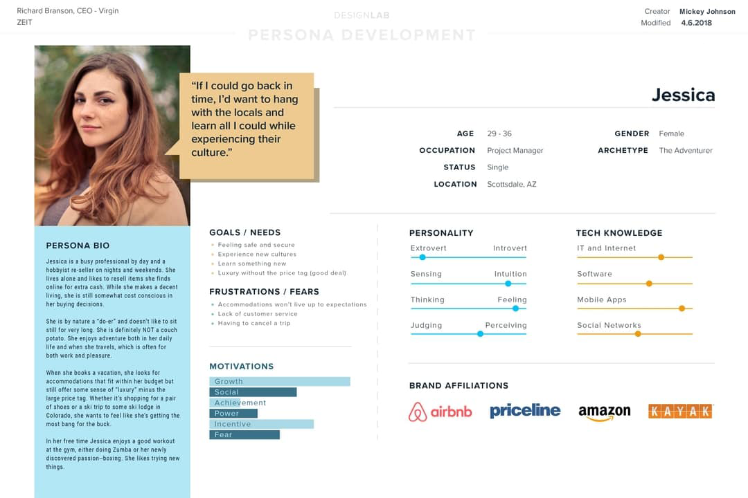
Meet Jessica, an educated, 30-something, single professional who is interested in new types of travel. Where did Jessica come from? She is a direct result of the interviews and survey results collected during the research phase of the project. While conducting the interviews, I noticed some patterns that began to form. I took those patterns and organized them using sticky notes and analyzed them. It was from this that the archetype of Jessica emerged.
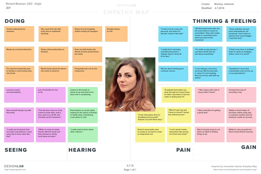
Empathy Map
Based on our persona, this empathy map takes a deeper dive into understanding Jessica. Six quadrants provide insight into who she is. This data came from interviews and observations. They sum up how the user feels, thinks, hears, etc. It’s all about what matters to Jessica. Knowing her struggles and victories helped me to find ways for her to achieve her goal and remove or minimize any barriers to it.
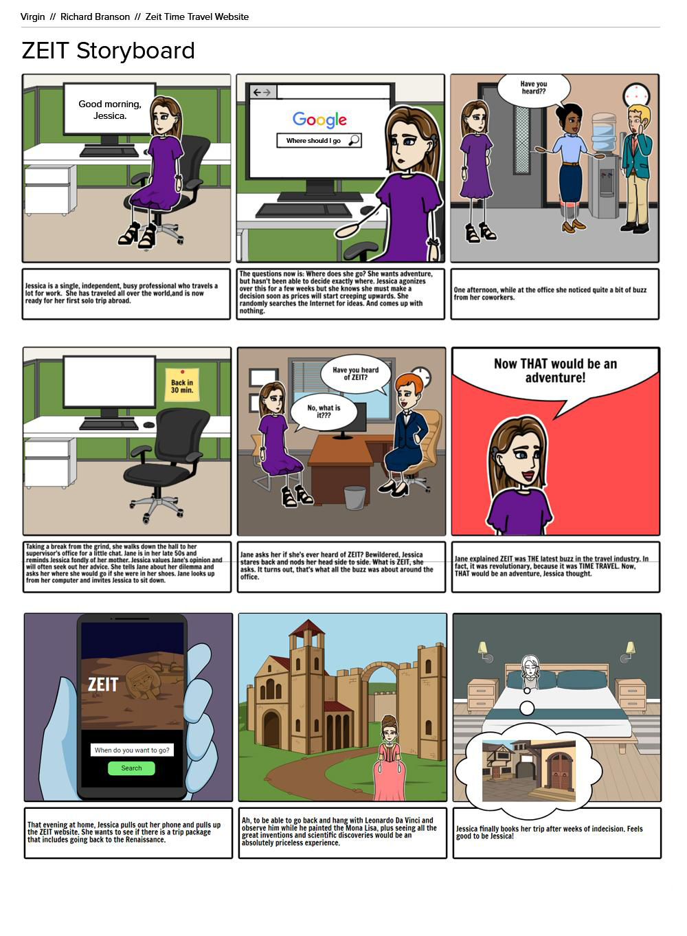
Storyboard
This storyboard illustrates a specific scenario where our user might utilize ZEIT. Jessica wants to go on a unique, and adventurous vacation but she is at a loss of where to go. When she hears her coworkers talk about ZEIT, a new time travel tourism website, her curiosity is piqued. This storyboard was created using the artifacts and research that came before it. It comes from interviewees' stories and real life experiences, which resulted in this fictional account. This tool helps me better understand the circumstances from which Jessica would encounter and use ZEIT.
Card Sorting
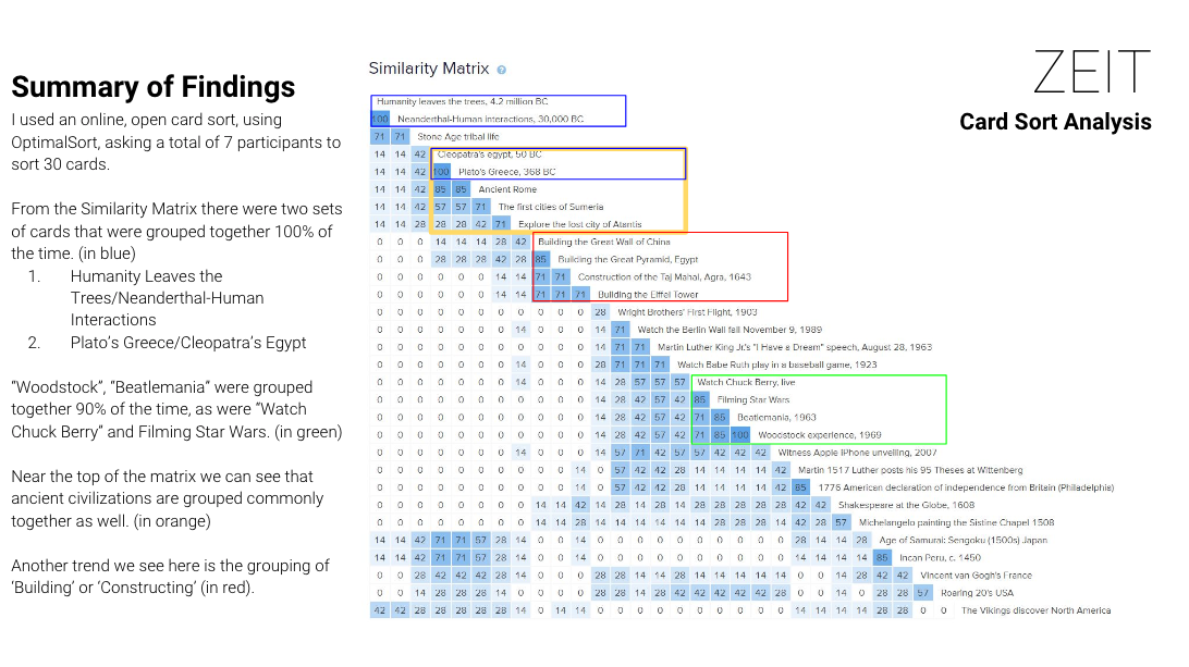
During this card sorting session, seven remote participants were asked to organize topics into categories that made sense to them using an online card sorting website called, OptimalSort. I used an open sort for this exercise because I wanted to get a feel for structure. From the results, I analyzed the data and found patterns/trends in both the quantitative and qualitative data, establishing the beginning of site's information architecture. View the full card sorting results.
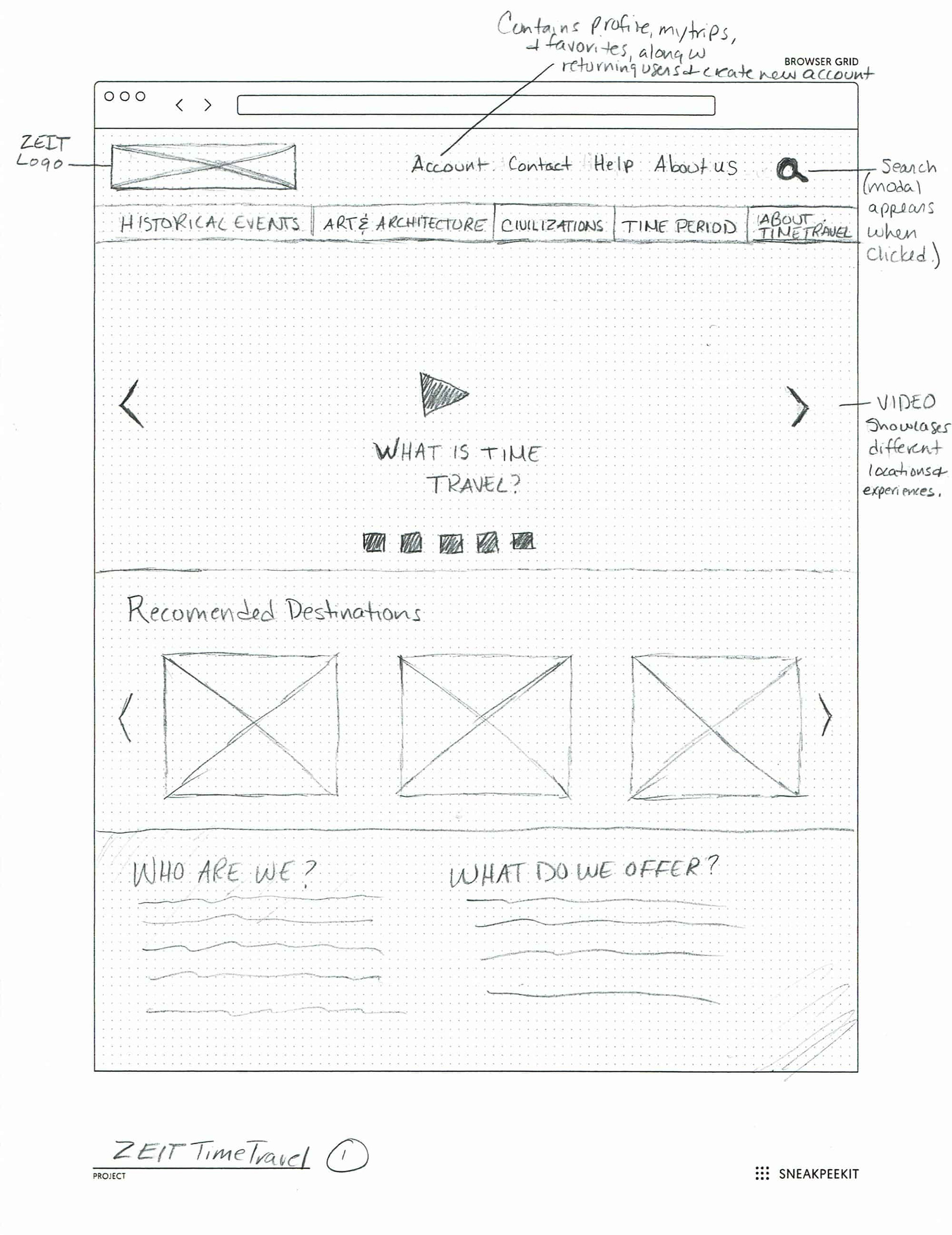
Sketches
Now that I have a basic understanding of the IA structure, I quickly ideated/brainstormed some design ideas. Here, I started with just the homepage in order to get a sense for where the major elements might fall on the page, keeping it very loose with the understanding it will change. The client liked the direction we were going in and I began to develop other pages in this way. View the full size sketches.
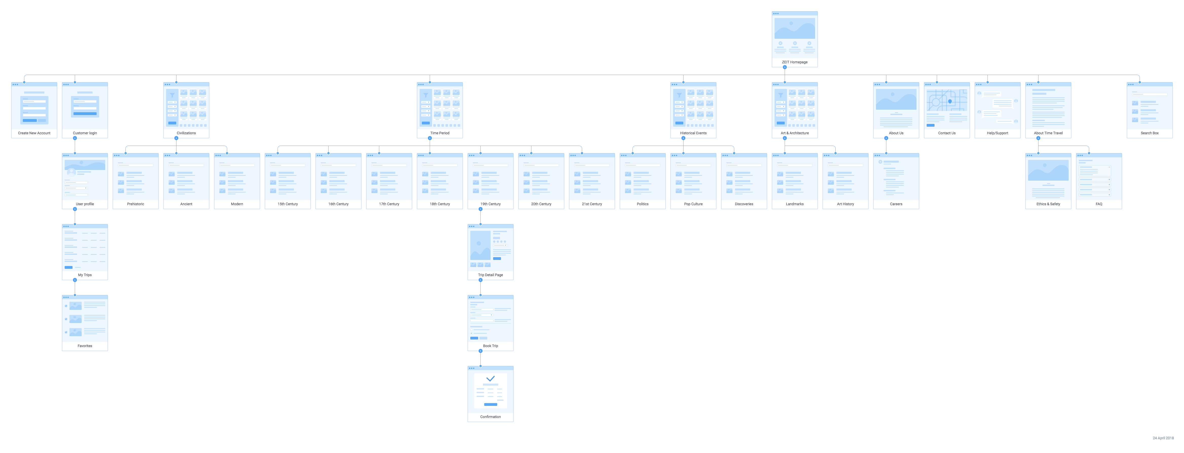
Sitemap
Next, I create a sitemap based on the results of our card sorting activity. Using categories that came out of the card sorting data, a sitemap shows the relationship between content on the site, starting with the homepage at the top, and then branching out into subsequent pages from there. View the full sitemap.
Task Flow & User Flow
Task Flow
The task flow is the main flow our users will follow to complete the main task (in this case, finding and purchasing a trip), identifying key screens that will eventually fit into the larger flow. I used the storyboard as a guide through the main task flow. View the full task flow.
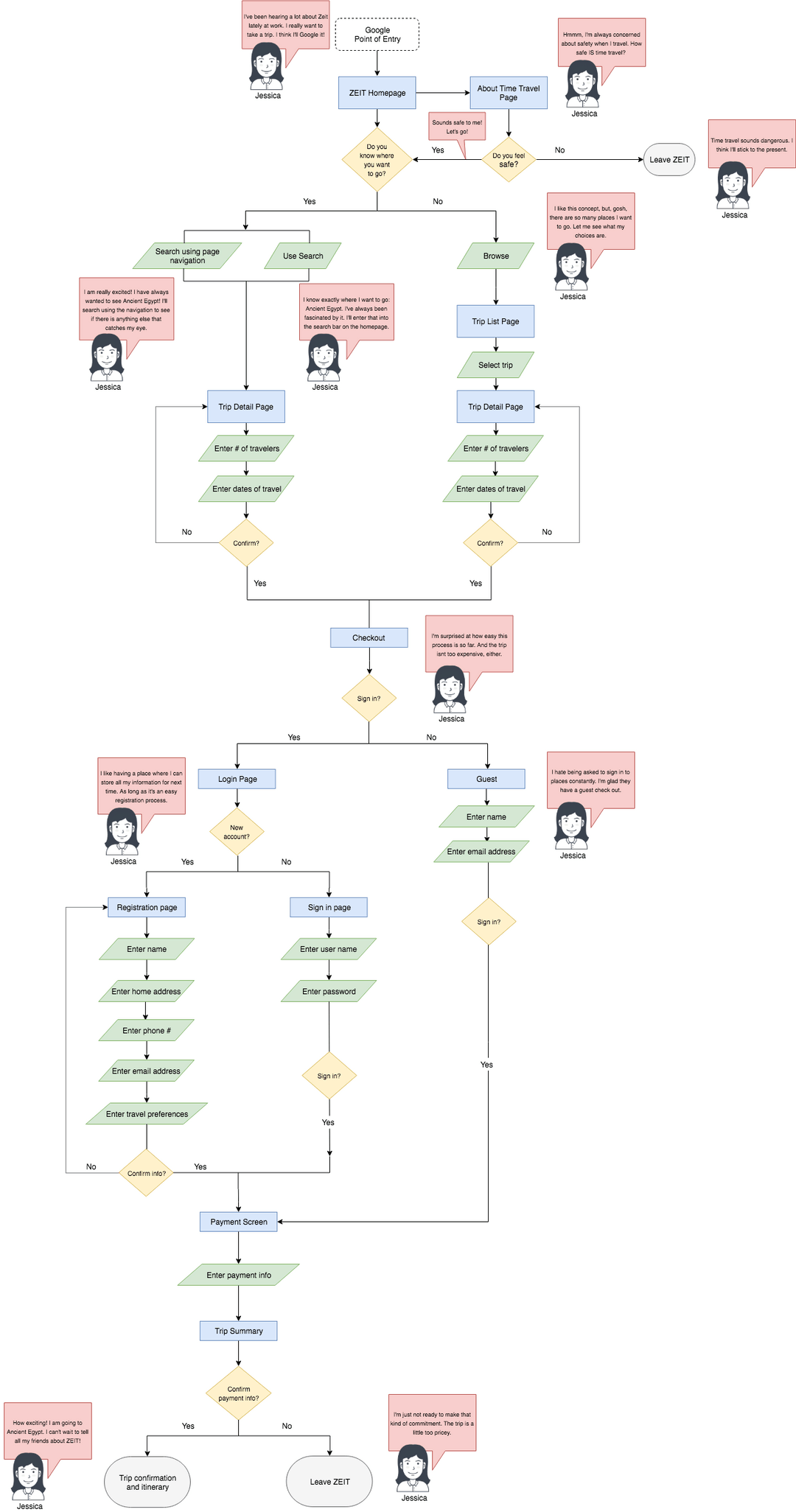
User Flow
I took the task to the next level and add in complexities and decisions to the flow. It also allowed me to explore how a user may come into the site (point of origin). Here, I also explored searching behaviors, what items they are likely to purchase, and the check out process. This represents the entire buying process from beginning to end, also accounting for the decision points along the way. View the full user flow.
I took the task to the next level and add in complexities and decisions to the flow. It also allowed me to explore how a user may come into the site (point of origin). Here, I also explored searching behaviors, what items they are likely to purchase, and the check out process. This represents the entire buying process from beginning to end, also accounting for the decision points along the way. View the full user flow.
DESIGN
Low Fidelity Wireframes
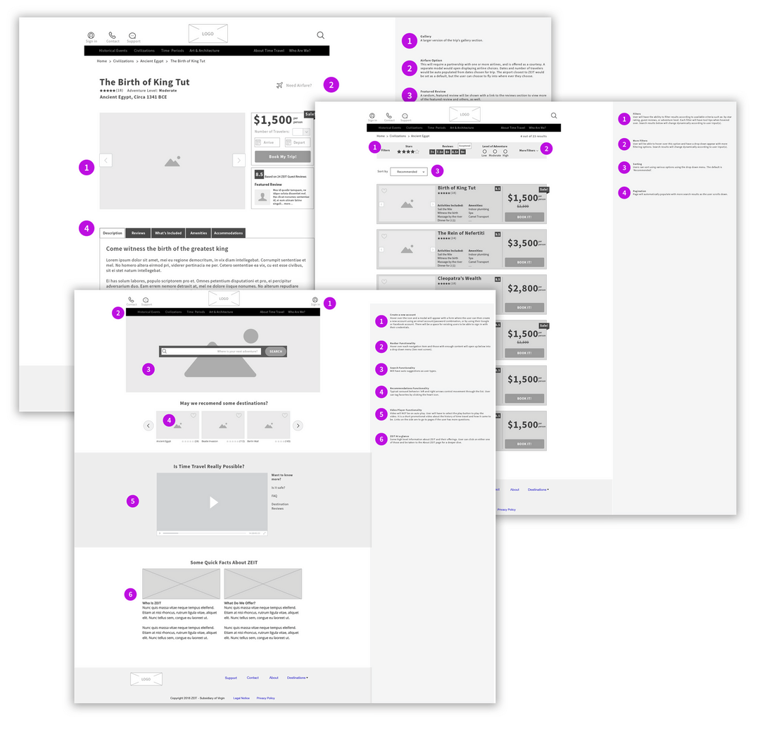
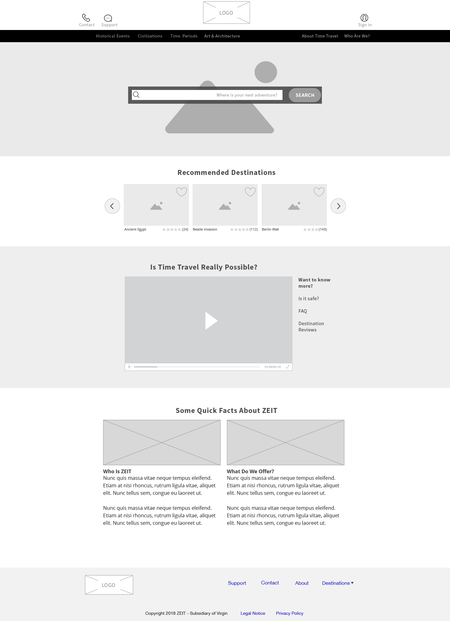
These low fidelity wireframes take everything up to this point and organizes the information architecture into something more visual. I used the card sorting and the site map artifacts to help with this task to map out the main screens. I started with the desktop version. The numbers show annotations where interactions that are not obvious require some explanation. View the full size low fidelity wireframes.
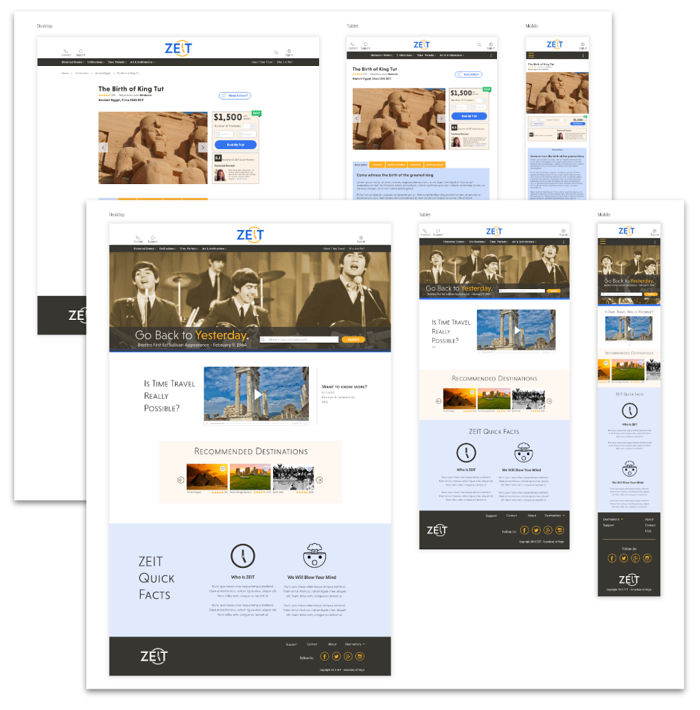
Responsive Wireframes & Low Fidelity Prototype
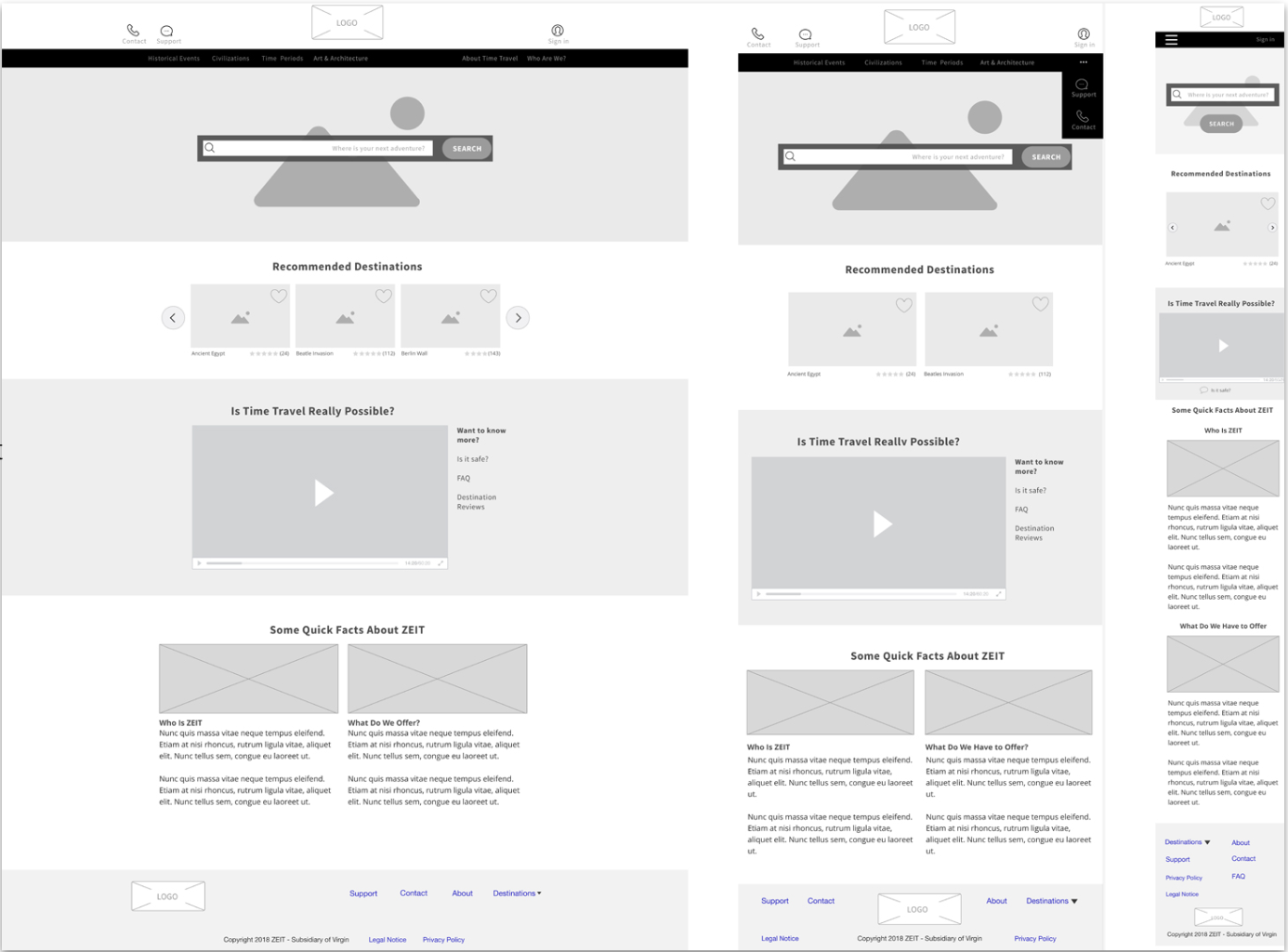
I did not design this mobile first. While I understand why someone would want to do it that way (to understand which basic elements fit within the smallest screen size), it is not my preference. I designed the desktop first and here I am breaking it down into its smaller parts: tablet and smartphone viewports. Deciding what the user needs to see as the screen size shrinks is no easy task. I decided to keep the most crucial items visible while progressively disclosing the rest down to secondary menus. View the full size responsive wireframes.
I took the wireframes created in the previous step and turned those into a low fidelity prototype. The goal of this prototype was to get user feedback early on in the process. After collecting that feedback I made some changes to the wireframes and iterated on those. View the full size low fidelity prototype.
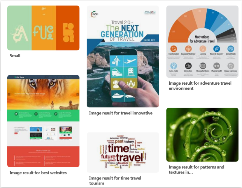
Moodboard
I gathered inspiration from around the Web for how the design for ZEIT might look and feel. I included potential colors, fonts/typography, textures, and anything else that might inspire me. This exercise helped the client to visualize what the site's elements and mood could look and feel like. This moodboard provided me with a jumping off point to create the site's branding.
Branding
Logo Design
The logo is the flagship of branding. This process began with coming up with words that embodied what the company was about, followed by rough sketches, and finally into the version seen here. View the full size logo.
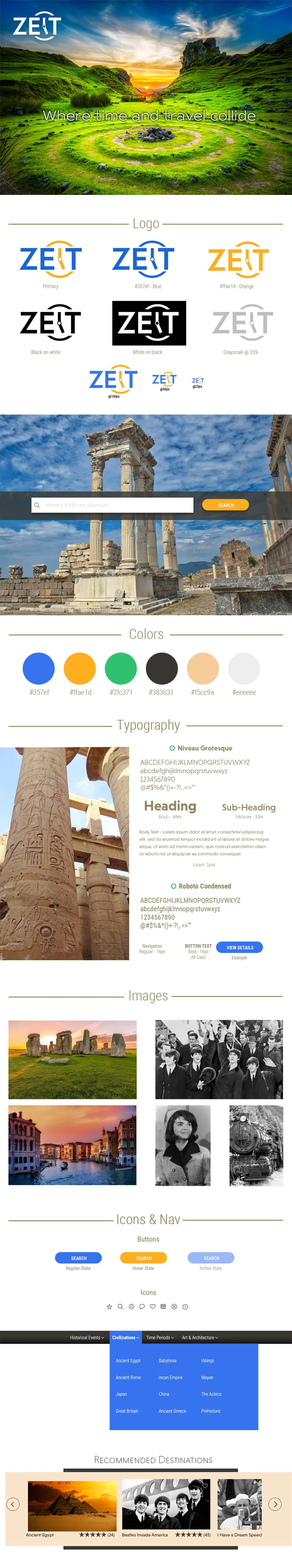
Style Tile
Using the mood board as a jumping off point, the style tile you see here is a direct result of that effort. The style tile shows the color palette, typography, logo usage, photo usage, and any components and how they will be used (search, menus, etc). Please note that this is only part of the style tile. View the full size style tile.
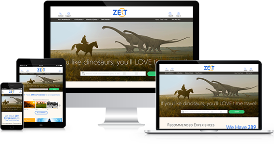
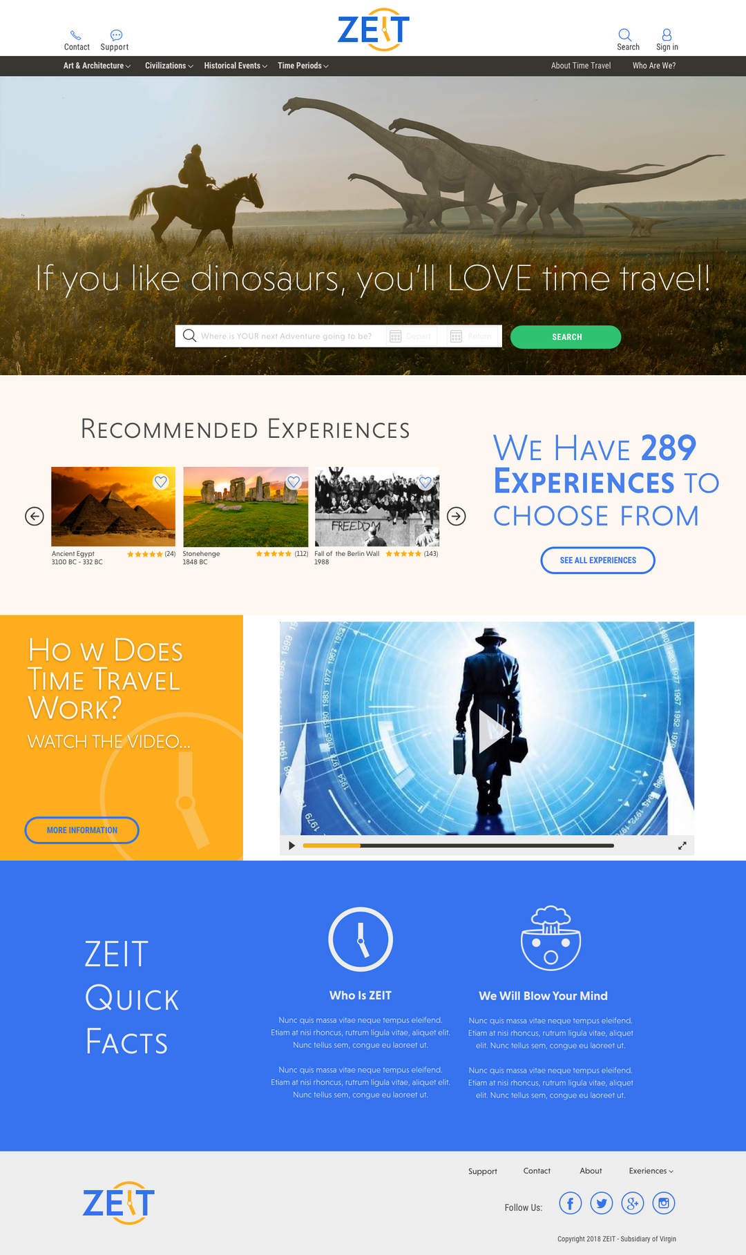
High Fidelity Responsive Design
In this step, I did a more polished, high fidelity version of the low fidelity responsive design mockups done earlier. It’s the same concept, except I applied the aesthetics from the style tile. This version contains all of the fonts, buttons, components from the style tile. View the full size high fidelity responsive design.
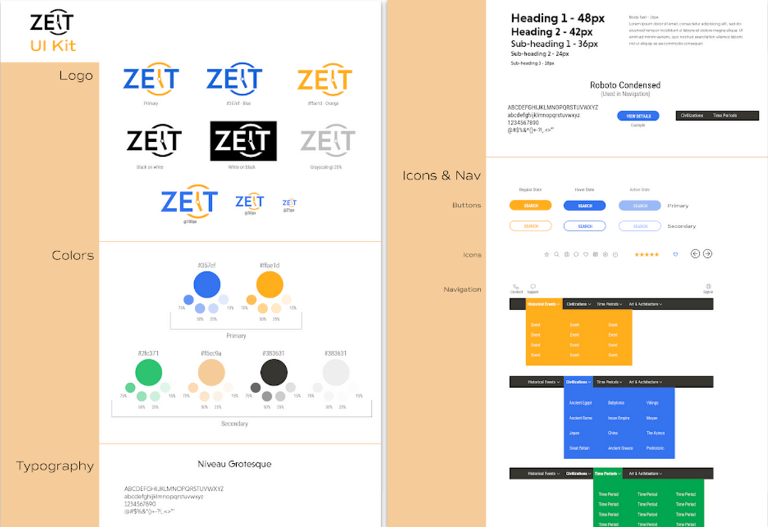
UI Kit
From our responsive design and style tile comes the UI Kit. The UI kit is a standardized, comprehensive inventory of all the components and design patterns and defines how they should look inside of the site. It sets the standard for the developers to follow and for the design of subsequent pages. A UI kit also identifies navigation and button states. View full size UI kit.
Usability Testing
Participants
5 - Caucasian Females
Ages 22 - 37
Test Objectives
Determine the ease at which users can navigate through the ZEIT
website to accomplish their task, which will be to book a travel
destination.
website to accomplish their task, which will be to book a travel
destination.
Observe how users prefer to search for a trip.
Test the overall ease of use of navigating the ZEIT website.
Observe any frustrations or obstacles users may have that may
impede their ability to complete their task.
impede their ability to complete their task.
Test Summary
Very little trouble completing the given task
The site was easy to navigate and made sense.
People were confused what the site was for.
Users used a variety of ways to search.
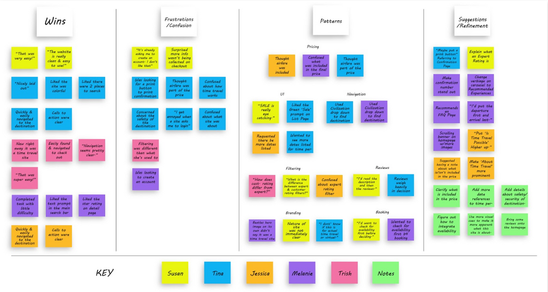
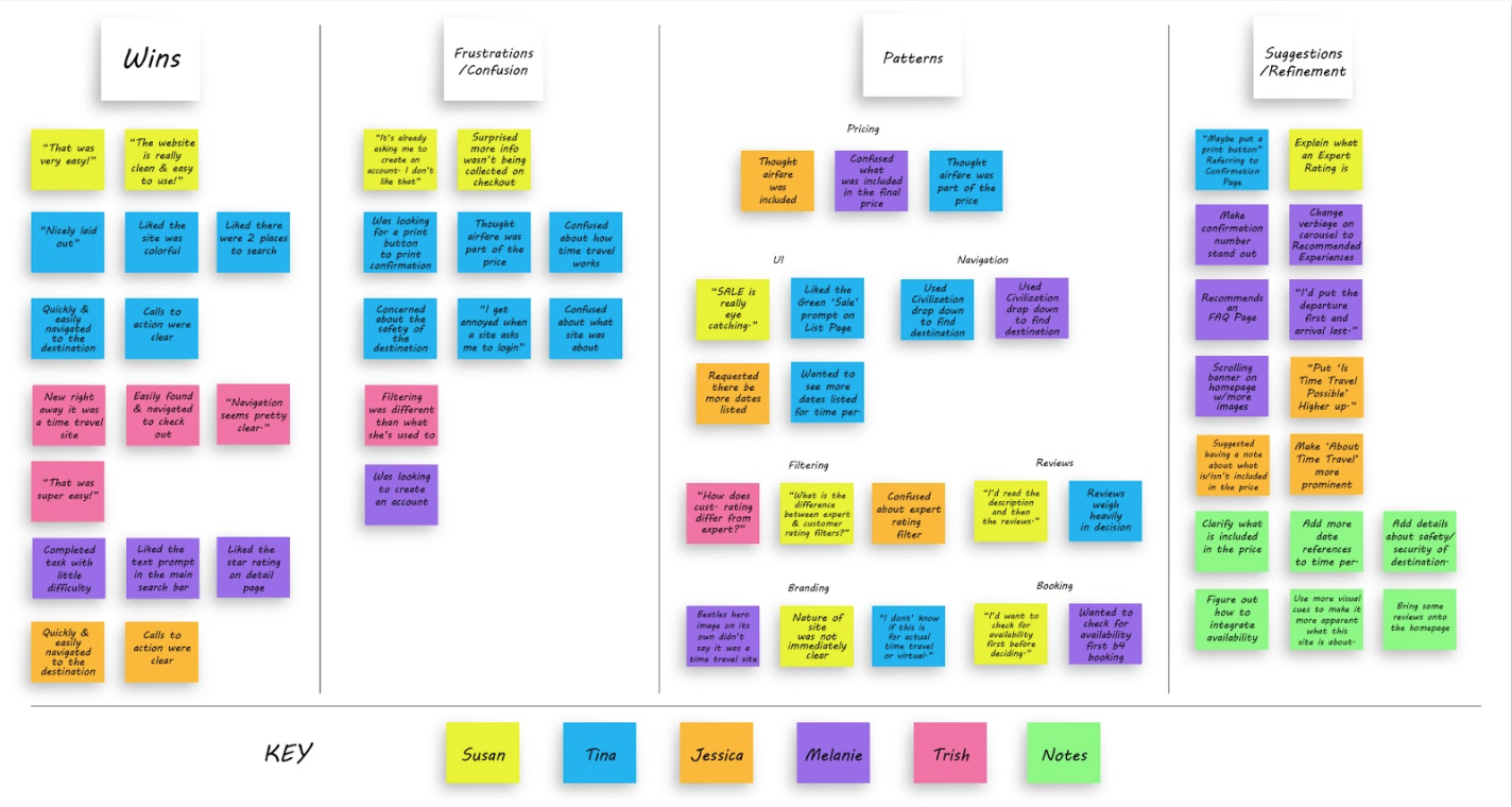
Affinity Map
An affinity map is created from the findings during the usability testing. The map helps sort, prioritize, and rank user feedback. For this, I wrote all of the feedback onto sticky notes and organized them into categories. From those results patterns emerged and from those patterns I was able to come up with what refinements should be made to the design. View the full size affinity map.